Are you looking for an effective way to upgrade your app? Consider using a cool animation. Flutter renders everything on the screen, relying on the Skia graphics library instead of those pesky native views. Therefore, you can animate anything. In this tutorial, you will learn how to implement basic animations in Flutter.
Implicit animations
Flutter includes a series of animated versions of widgets that you’ve probably already used in your app. For instance, you will see widgets like Container -> AnimatedContainer, Positioned -> AnimatedPositioned, and Opacity -> AnimatedOpacity in this tutorial. These widgets automatically animate changes to their properties. They extend ImplicitlyAnimatedWidget, which is why these animations, in general, are called Implicit animations.
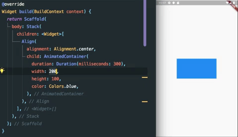
AnimatedContainer in action (using hot reload)
Although implicit animated widgets are easy to use, they have some disadvantages. Most importantly, – you don’t have complete control of these animations, so it is impossible to implement repeating animation, listen to the animation state, and react to the changes.
Practice
Let’s look at how to use one of those widgets to implement animations in your app.
This app has a typical structure: AppBar, a home page, and a drawer (side menu). We will implement the drawer ourselves for this sample instead of using the drawer property in the Scaffold widget. The
Here, we create a basic app with MainPage and Container, which is our implementation of drawer.
class App extends StatelessWidget {
  @override
  Widget build(BuildContext context) {
    return MaterialApp(
      home: Home(),
    );
  }
}

class Home extends StatefulWidget {
  @override
  _HomeState createState() => _HomeState();
}

class _HomeState extends State {
  var isShownMenu = false;

  @override
  Widget build(BuildContext context) {
    final width = MediaQuery.of(context).size.width * 0.65;
    final height = MediaQuery.of(context).size.height;
    return Scaffold(
      appBar: AppBar(
        backgroundColor: Colors.blue,
        title: Text("Home"),
        leading: IconButton(
            icon: Icon(Icons.menu),
            onPressed: () {
              setState(() {
                isShownMenu = !isShownMenu;
              });
            }),
      ),
      body: Stack(
        children: [
          MainPage(),
          Positioned(
            width: width,
            height: height,
            left: isShownMenu ? 0 : -width,
            top: 0,
            child: Container(
              width: width,
              color: Colors.redAccent,
              height: double.infinity,
              child: ListView(
                  children: [
                    ListTile(title: Text("Home"),),
                    ListTile(title: Text("Settings")),
                    ListTile(title: Text("Logout"),)
                  ],
                ),
              ),
          ),
        ],
      ),
    );
  }
}
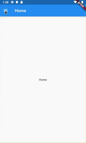
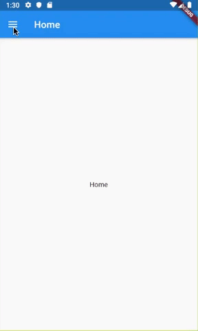
Drawer without animation
You can see AppBar here with an icon button for the opening menu. The body of the Scaffold consists of a Stack with a main page and our drawer. Its visibility is controlled by setting negative left when hidden, and zero left when visible. MainPage is a simple container with a text widget that is omitted for brevity. There are no animations, and the drawer opening looks a little clunky.
We can add a simple animation by replacing Positioned with AnimatedPositioned. Let’s check the code.
  @override
  Widget build(BuildContext context) {
    ………
      body: Stack(
        children: [
          MainPage(),
          _buildAnimatedMenu(width, height),
        ],
      ),
    );
  }

  Widget _buildAnimatedMenu(double width, double height) {
    return AnimatedPositioned(
        duration: Duration(milliseconds: 300),
        width: width,
        height: height,
        left: isShownMenu ? 0 : -width,
        top: 0,
        child: MainMenu(
          width: width,
        ));
  }
Like AnimatedContainer, the AnimatedPositioned widget will animate any changes to its properties; this is precisely what we need. By setting only one additional property – duration, which defines how long the animation will run, we added animation to the drawer opening.
Usually, the drawer menu should dim the object behind it. You can implement such behavior in many ways, but we will use AnimatedOpacity in this case.
  @override
  Widget build(BuildContext context) {
    ………
      body: Stack(
        children: [
          MainPage(),
          _buildBackgroundSkim(), // new code
          _buildAnimatedMenu(width, height),
        ],
      ),
    );
  }

  Widget _buildBackgroundSkim() {
    return AnimatedOpacity(
      duration: Duration(milliseconds: 300),
      opacity: isShownMenu ? 1 : 0,
      child: Container(
        color: Color.fromARGB(42, 0, 0, 0),
      ),
    );
  }
The new function returns anAnimatedOpacity widget with the same duration as our previous animation. The property opacity is set to 1 if the menu is visible and to 0 if not. The child of this widget is a simple Container with a transparent grey background.
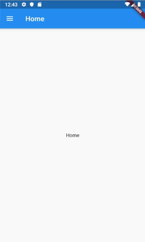
The result of using AnimatedPositioned and
AnimatedOpacity (background dimming)
Adding Curves
By default, animations in all animated widgets are constant; they change their values linearly. Changing the curves is as easy as setting another property in the constructor. Look at the code below.
Widget _buildAnimatedMenu(double width, double height) {
    return AnimatedPositioned(
        duration: Duration(milliseconds: 300),
        width: width,
        height: height,
        left: isShownMenu ? 0 : -width,
        top: 0,
        curve: isShownMenu ? Curves.bounceOut : Curves.linear, // new code
        child: MainMenu(
          width: width,
        ));
  }
}
If the menu is shown, the linear curve is set, so the following animation (dismissing the menu) will be linear; otherwise, bounceOut is set. All possible predefined curves can be found here.
Conclusion
Using Implicit Animated Widgets is the most straightforward way to implement basic animations in Flutter. But keep in mind that basic animations don’t repeat forever and are only for one widget. If you want to implement custom animations, check AnimatedWidget and AnimatedBuilder.